Market Insights
In this section, you will be able to understand the key offerings of the PISTIS Market Insights, providing you with actionable insights to address your assets' performance issues, optimise strategies, and track asset transactions effectively. It is designed to provide a comprehensive overview of sales metrics, market trends, and asset metrics and consists of three tabs, explained below:
- Overview: Displays high-level insights and analytics.
- Assets: Focuses on individual assets.
- Sectors: Shows performance metrics categorised by sectors.
Overview
This dashboard provides an interactive summary of key metrics and analytics for asset management, helping you to track your assets' performance through the provision of sales metrics and market trends.
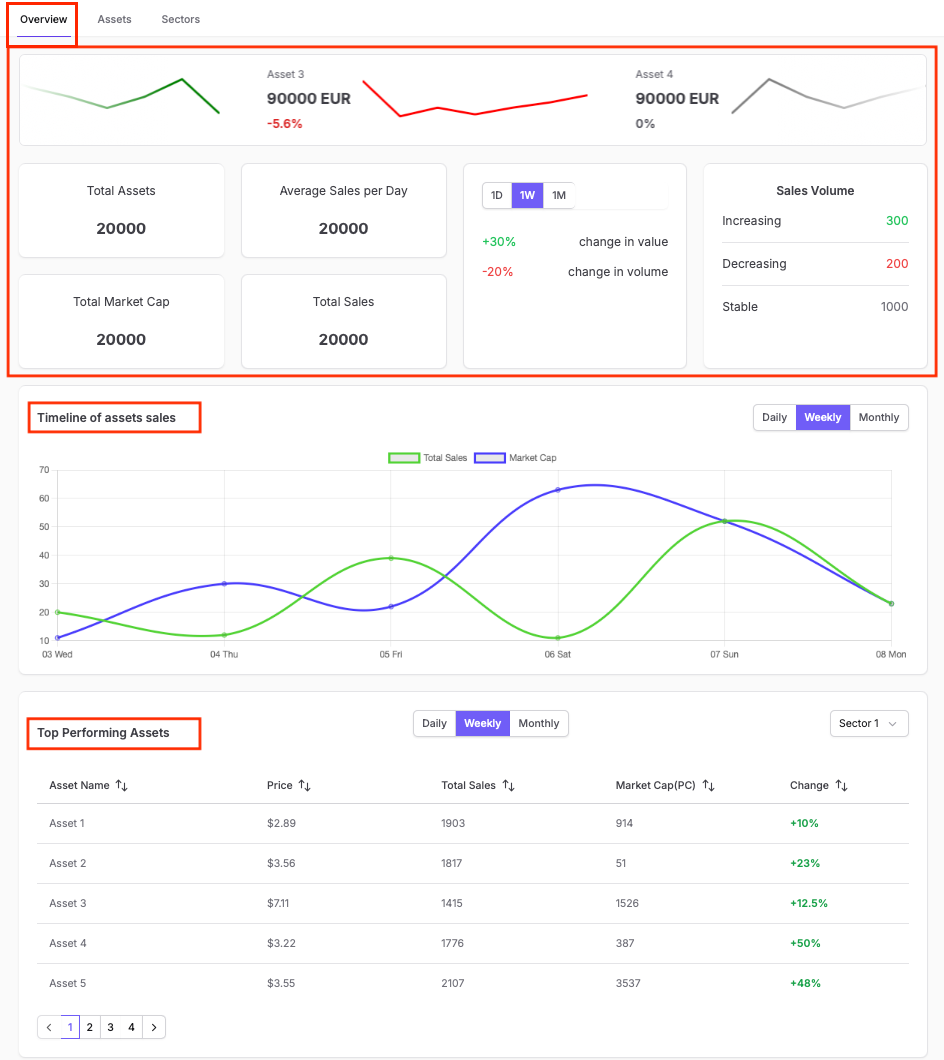
Here, you can see specific details on your assets, their value, and changes, along with global metrics (referring to total asset count, average sales per day, total market cap, and total sales), your sales volume performance, and percentage changes in value and volume highlighted in red for decreases and light green for increases.
Timeline of Asset Sales
Through this graph, you can monitor daily, weekly, and monthly sales. Toggle between "Daily," "Weekly," or "Monthly" ( to identify spikes and dips in asset performance over time and understand trends. Hover over the lines in the chart for precise values at specific points.
Top Performing Assets
Review the table to identify the best-performing assets and focus on their sales, price, and market cap. Use the provided timeframe toggles (Daily, Weekly, Monthly) to compare short-term vs. long-term trends. Apply the sector filter to narrow down insights for targeted sectors. Click on the column headers to sort by ascending or descending order.
Worst Performing Assets
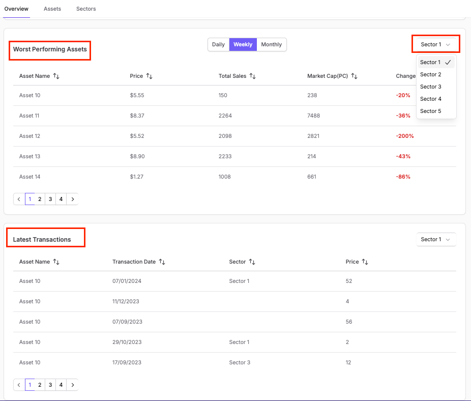
Review the table to identify assets with the largest negative changes in performance. Use the toggles (Daily, Weekly, Monthly) to focus on specific periods and analyse short-term or long-term trends in underperformance. Apply the sector filter to narrow down the worst-performing assets within a particular sector.
Latest Transactions
Review the table listing recent activities for each asset to monitor your latest transactions and identify frequent activities, unusual behaviours, or changes in sector performance. The columns include:
- Asset Name: Name of the asset involved in the transaction.
- Transaction Date: Date of the transaction.
- Sector: Sector where the transaction for a given asset occurred.
- Price: Price at which the transaction was made.
- Navigate through the paginated table to explore older or more recent transactions.
- Apply the sector filter to view transactions for a specific sector of interest.
Assets
This dashboard provides you with a visual overview of your top-performing assets equipping you with actionable insights to optimise your strategies, track performance, and enhance decision-making in managing your assets.
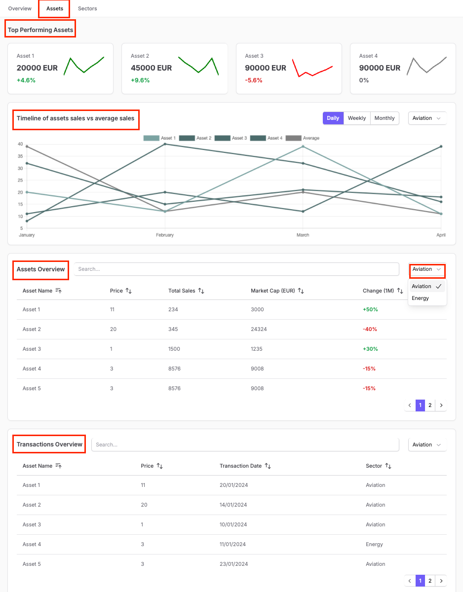
Top Performing Assets
Through this metrics you can quickly identify the top-performing assets of your portfolio with their current value and percentage change (in green for increases, red for decreases). The graphs above each asset display the performance trend over the selected period.
Timeline of assets sales vs average sales
Through this interactive Chart, you can view trends in asset sales compared to average sales over time. You can use select the preferred timeframe:Daily, Weekly, or Monthly and the chart dynamically adjusts based on your selection You can use the sector filter to analyse trends specific to a particular industry, such as “Aviation.”
Assets Overview
Through the “Assets Overview” table you can search for specific assets (using the search bar.) and have access have access to detailed Metrics, including: • Asset Name: The name of the asset. • Price: Current price of the asset. • Total Sales: Number of sales in the selected period. • Market Cap (EUR): Total market capitalisation in euros. • Change (1M): Percentage change in performance over the past month.
You can click on the column headers to sort data, by ascending or descending order You can also use the sector dropdown to filter assets by industry, such as “Aviation.”.
Transactions Overview
Through the “Transactions Overview” table you can search for specific transactions (using the search bar.) and have access have access to details, including:
- Asset Name: Name of the asset involved in the transaction.
- Price: Price at which the transaction was made.
- Transaction Date: Date of the transaction.
- Sector: Sector where the transaction for a given asset occurred You can click on the column headers to sort data, by ascending or descending order You can also use the sector dropdown to filter the transactions by industry, such as “Aviation.”.
Sectors
This dashboard focuses on sector-specific performance, providing you with insights into sector-level changes, sales trends, and comparisons across sectors.
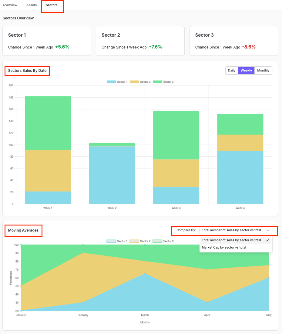
Sectors Overview
Enables you to quickly identify performance changes for different sectors compared to one week ago. Percentage changes for each sector are presented, where:
- Positive changes are highlighted in green.
- Negative changes are highlighted in red.
Sectors Sales By Date
This interactive bar chart displays sector-wise sales performance over time, where each sector is colour-coded for clear distinction. You can toggle between Daily, Weekly, and Monthly views for granular or broader trend analysis.
Moving Averages
This trend analysis line graph enables you to compare moving averages for sector performance over time. You can adjust the focus of the comparison (e.g., total number of sales or market cap by sector vs. total) using the “Compare By” dropdown.
Scrolling further down :
.
- Market Cap distribution among the same sectors (right-hand side chart).
Asset Performance By Sector
Here, you can review the performance of assets within a selected sector over the chosen timeframe. Sort the results by various asset metrics such as Total Sales, Market Cap, Price, Percentage Change, or Date of Acquisition using the dropdown menu. Green numbers indicate positive changes, while red numbers represent negative changes in performance.
You can also toggle between Daily (1D), Weekly (1W), and Monthly (1M) views to track performance changes over time.
Top Performing Assets
Here, detailed metrics for the top-performing assets are displayed, such as:
- Total revenue generated by the asset (in EUR).
- Number of sales made by the asset.
A line graph for each asset shows its performance trend over time, enabling you to track growth or stability.